
iLion Digital
iLion is a Ukrainian digital agency aiming to expand its services to the e-commerce market. To achieve this, they wanted to promote their offerings through a landing page.
The goal of this project was to increase reach and attract new users while maintaining brand consistency and identity.
Prototype
ROLE
UI Designer
Competitive Analysis, Wireframing, Prototyping & Testing
TIMELINE
15 Dec 2024 - 14 Feb 2024, Full-time
TOOLS
Figma
Problem Space
As iLion expands into the e-commerce market, it faces the challenge of effectively communicating its new services and attracting potential clients.
The lack of a targeted landing page limits visibility, making it difficult to engage e-commerce businesses looking for digital solutions. To establish credibility, increase reach, and drive conversions, iLion needs a strategic, well-designed landing page that aligns with its brand while effectively capturing the attention of its new audience.
Benchmarking
To understand the industry landscape and how companies address challenges, I conducted a competitive analysis. I analyzed Ukrainian companies to gain insights into the local market and user behavior, while also examining foreign companies, which tend to be more user-oriented and advanced in this space. This helped me identify best practices and areas for differentiation.
Sketches
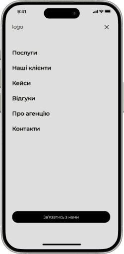
Since a significant percentage of users access products via mobile devices, a mobile-first approach was essential. Prioritizing mobile design ensured a seamless user experience and allowed us to reach a broader audience.
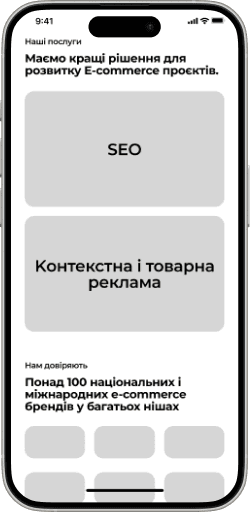
Wireframing Solutions
Given the project’s time constraints, I quickly developed grayscale wireframes to present the content structure to stakeholders efficiently. This approach allowed for rapid feedback and approval before moving into high-fidelity design.
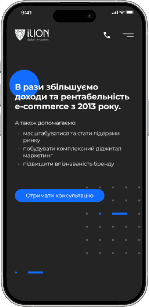
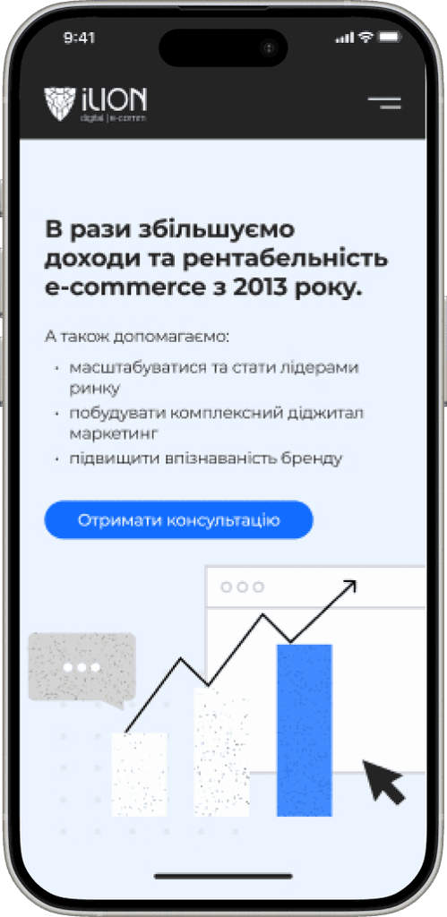
Hero Section

Education Screen
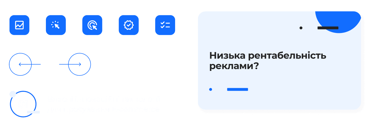
Symptom Screen
UI Library
Colors

Typography
UI Elements
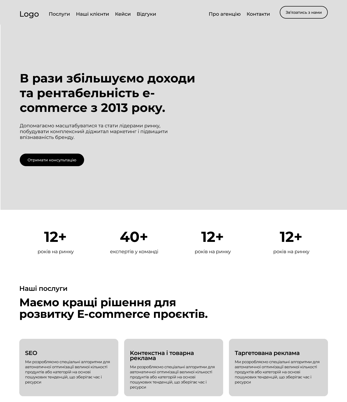
High-fidelity design
The company had an established brand identity, which I had to incorporate into the design. It was an interesting challenge to work within existing guidelines while also creating new components that aligned with the overall style.
Hero Section v1
Hero Section v2
Servises Section

Customers Needs

Contact Form

FAQ

Final Prototype
Through ongoing collaboration with stakeholders, I balanced user experience with business objectives. Gathering feedback and iterating on the design ensured the final product met both user needs and company goals. This iterative process was crucial in refining the design to achieve the best possible outcome.
Key Takeaways
Focus on the Problem, Not the Solution. I learned the importance of not jumping straight to a solution. While it can be tempting to assume you already know what users need, this approach risks overlooking the real problem. During my research, Ichanged my initial idea to a completely different solution, highlighting why it's crucial to define the problem first.
Always think about the user's perspective.. With a sensitive topic, it was challenging to decide how to approach it effectively. I realized the importance of using the right wording to avoid overwhelming users while still conveying the message clearly.
The Importance of Organization. With a strict time limit, staying organized was essential. Keeping my assets and research findings well-structured helped me access information quickly and showcase progress efficiently.

