
Steam
Steam is one of the largest gaming platforms, with over 100 million monthly active users. Maintaining usability is crucial for such a vast platform to attract new users and ensure a seamless experience for existing ones.
For this project, I collaborated with another UX designer to analyze and improve the game purchasing flow, a key revenue driver. Usability issues could lead to cart abandonment, so our goal was to refine the process for a smoother, more intuitive experience.
ROLE
UX/UI Designer
Heuristic Evaluation, Wireframing
TIMELINE
4 - 17 Nov 2024, Part-time
TOOLS
Figma
Understanding the Problem
To pinpoint key issues, we conducted a heuristic evaluation, assessing the interface against Jakob Nielsen’s 10 usability heuristics. Through this, we identified key problems related to Consistency & Standards, Flexibility & Efficiency of Use, and Error Prevention, including:
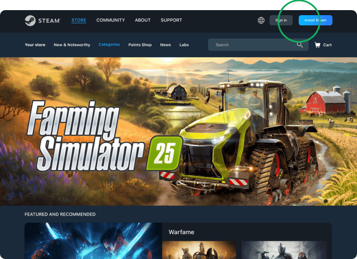
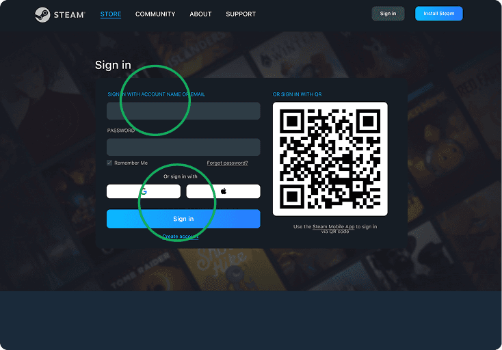
Confusing login process. Inconsistent CTA wording and multiple redundant options.
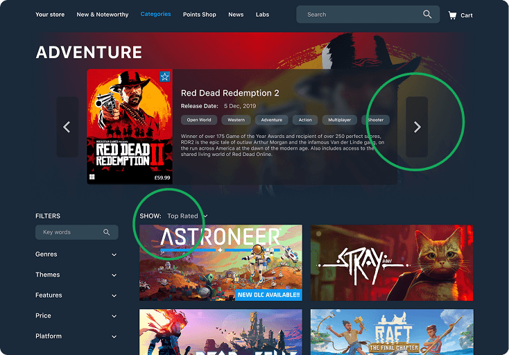
Overwhelming game selection. Complex layout and excessive filtering options increase search time.
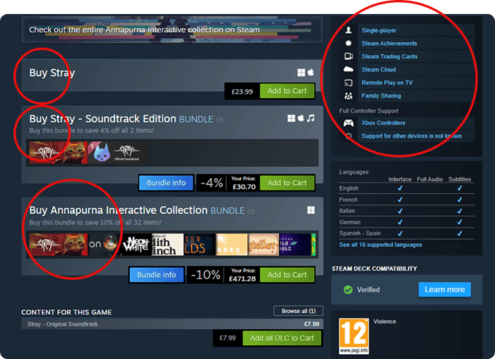
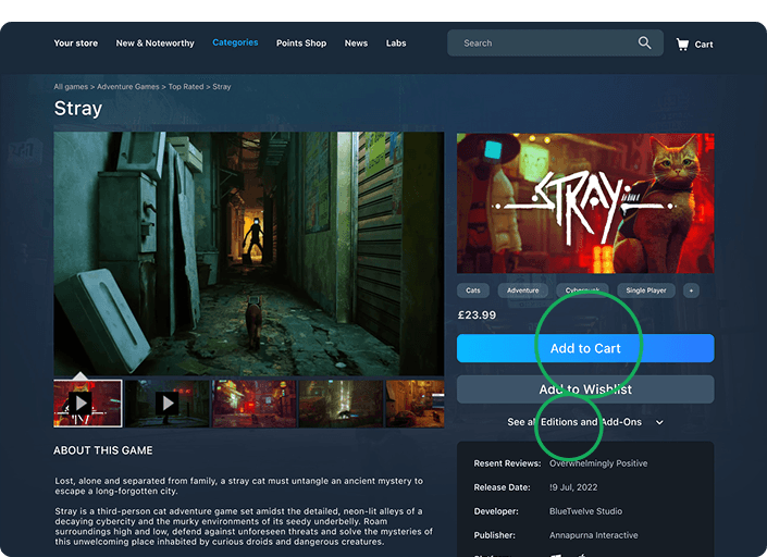
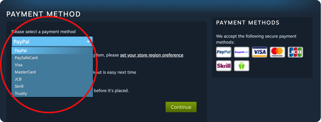
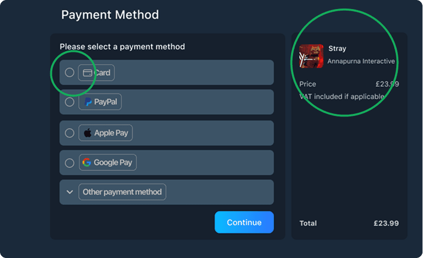
Checkout issues . Limited payment options and lack of clear purchase confirmation create confusion.
Brand Guidelines
Colors

Typography
Refining the Flow
Considering Steam’s extensive color palette and multiple CTA button styles, maintaining brand consistency while improving usability was a challenge. We first focused on organizing content for better clarity. My suggestion was to establish a consistent pattern for categories and simplify the navigation menus, which felt overwhelming.
Our key solutions included:
Standardizing CTA buttons to reduce confusion
Structuring the browsing system to make categories clearer and easier to find
Improving user feedback and streamlining login/payment options (Google Login, Apple Pay, Google Pay)
With these improvements in mind, we moved forward with wireframing and high-fidelity design.
Log In
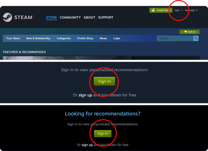
Before
After
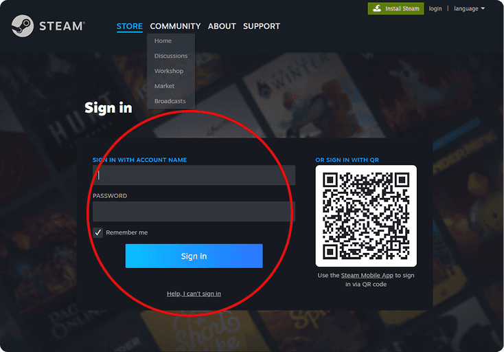
Before
After
Navigation & Categorization
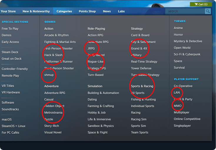
Before
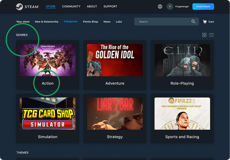
After
Before
After
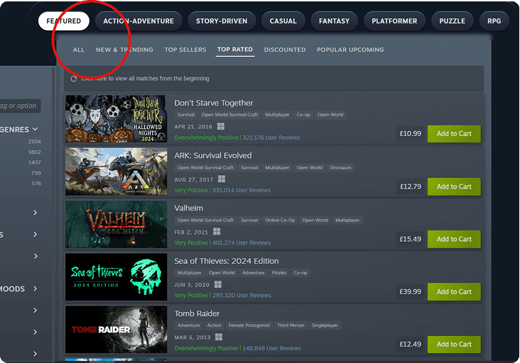
Purchasing System
Before
After
Before
After
Results & Impact
Streamlined UX. The user can now log in via various means, easily navigate to games and genres using the new fixed position navigation bar, engage in reviews in a more reader-friendly way and purchase using a wide range of methods. Through streamlining this process, the user is more likely to engage and continue engaging to follow the task flow through. Thus, improving purchase rate.
More effective clicks. The user can now move more directly towards their goals with improved CTA’s that provide clarity and meet expectations. This leads to improved user satisfaction and reduced cognitive overload which encourages re-engagement.
Key Takeaways
This project meant redesigning within the realms of an established brand and their identity. This meant we had to be mindful of what to alter and how much to alter.
Redesigning with two UX designers simultaneously called for constant communication on what we were doing, gaining feedback from the other and preventing any duplication of work.


